Apple company logo. The creator of the Apple logo about the myths about the color symbol of the company: “Many stories are more interesting than my logical explanation
On the pages of our site, we have already talked about the history of creating a store, as well as a voice assistant. Today we will talk about an equally important thing - about Apple logo which is known all over the world. Not everyone knows exactly what Macbook Pro different from the Air, but the bitten apple logo is instantly recognizable by almost everyone. In this article, we will tell not only about who and when it was created, but also how the company's earlier logos looked like.
So, first Apple logo was not at all like today. Its in 1976 was created by the third co-founder of the company Ronald Wayne, who is rightfully considered one of the biggest losers of the 20th century. The fact is that he sold his 10% stake in the company 11 days after its registration. Given the annual development of Apple, now Ron would be a billionaire, with about $ 40 billion.
![]()
The logo depicts an English scientist Isaac Newton on which an apple will soon fall. On the edges of the logo you can see the inscription: Newton… A Mind Forever Voyaging Through Strange Seas of Thought… Alone. This is a line from William Wordsworth's autobiographical poem The Prelude. It is worth saying that the logo turned out to be very interesting and unusual, but completely unsuitable for a technology company. So in less than a year Steve Jobs hired a graphic designer Rob Yanov, which was required to create a modern, recognizable and good looking logo.
![]()
The result is the well-known bitten apple, which is still the Apple logo today. However, then, in 1976, it was multi-colored. The colors were not chosen by chance: they symbolize the fact that Apple in those years was one of the few computers with color monitors that could display six colors. They have found their place in the logo, and the colors are arranged in a completely random order.
AT 1998 year, welcome back to Apple Steve Jobs the logo has been changed to a single color black, which we can still see on our Macs. It looks concise and simple, very well reflecting the main idea of all Apple products. However, on WWDC 2012 the company used a different, rather unusually colored logo.
![]()
Admittedly, it looks very nice, but expecting the company to change the logo once again is stupid, since another option was used. Apparently, the company every year will delight us with new versions of the logo for WWDC, indirectly reflecting the direction of development for this year.
Well, as we can see, the logo of the famous company The world has come a long way before reaching its final version. However, it is precisely Rob Yanova, who owns the very idea of a bitten apple, so well recognized today throughout the world.
In our turbulent times, people do not have enough time to sleep, to say nothing of memorizing all sorts of different brands. However, even in such conditions, there are several logos that almost every inhabitant of the Earth knows. For example, you can remember the perfect Mercedes star, the well-known inscription Coca Cola, the inscription of the Nike symbol, the white and blue BMW circle. Among these leaders, the Apple logo can be distinguished. Many people often have a question about the history of the origin of the Apple logo, and how it has changed over the decades.When did the Apple logo appear?
Apple owes its first emblem to Ron Wayne (Ron Wayne). Now the name of this person is almost forgotten and people who are well versed in the history of Apple hardly remember him. Although this person was the third co-founder of the tiny Apple company. And no one remembers him for a very simple reason, this loser, and what else can you call a person who got rid of the shares of a young company after only 11 days from the date of foundation. He sold them for $800. Imagine how much money he would have now. After all, he had 10 percent of the shares, and in modern times this is a cosmic amount. The symbol that Wayne came up with for his company has nothing to do with the current logo.. It was a carefully crafted picture, in which Isaac Newton occupied the main place, an apple was located on top, it symbolized insight. Much later, Apple will remember Newton when it develops the first PDAs.
On the first Apple logo, small words are inscribed, if you look closely, you can read " Newton… A Mind Forever Voyaging Through Strange Seas of Thought … Alone", which can be translated into Russian as " Newton... The mind is always sailing through the many seas of thought... alone". This paragraph was borrowed from a fairly well-known poem in the West by William Wordsworth called "Prelude".
Indeed, the symbol turned out to be very sensible. All these mysterious references to Isaac Newton gave the logo a certain veil of mystery. However, for modern business this logo fit very little. It is for this reason that a year after the founding of Apple, Steve Jobs decided to find a completely new symbol. So he went to a great designer named Rob Janoff. Steve Jobs gave the task to create such an emblem so that it looks modern and at the same time is perfectly recognizable among many similar ones.
 During the week, this graphic designer was fully occupied with the task at hand. Many years later, he was interviewed in which he revealed the secret of how he came up with this logo. Rob went to the store, where he bought apples of various shades, then he put them in a vase and began to draw. Gradually removing various elements. That very bite was drawn by him quite deliberately, because his task was to depict such an image of a fruit so that it was strongly associated with an apple, and not, say, with berries, vegetables or fruits. Moreover, in English language the word byte and bite are spelled almost the same (byte/bite), which added even more meaning.
Myths about the appearance of the Apple logo
First legend. Rob depicted the company's logo with rainbow colors. Subsequently, many people began to slander that this coloring is somehow very similar to the symbols of gay minorities, and if we speak Russian, to the symbolism of pederasts. Although this is fundamentally not true, because that famous emblem began to be used a whole year before the buggers invented their rainbow logo. Second legend. It is believed that an apple painted in rainbow colors is a kind of tribute to A. Turing. This man is famous for being able to hack Enigma cipher and Kriegsmarine, and after the war had a strong influence on the development information technologies. For example, he came up with a special test for intelligence, which later became known as Turing test.
However, even here there were no pederasts. In the West, without this, there is nowhere to go, universal pederasty. So, it turns out that Turing was gay and the authorities began to persecute him for homosexuality, and a not very bright future awaited him. After all, serving two years in prison, where every convict knows about your inclinations, is not very similar to a walk through a flowering meadow. As a result, he was forced to undergo hormone therapy, as a result of which many women's breasts grow and infertility occurs. Moreover, the tolerant authorities forbade this talented pederast from doing his favorite thing. No, in this case, it means not love games with men, but cryptography.
This was a cruel blow to the fragile and tender soul of the scientist gay. As a result of mental anguish, he committed suicide after a while. Yes, being a pederast in the West is a thankless task, and sometimes dangerous for the psyche. What's with the apple, you ask? The thing is that Turing decided to leave this disgusting life in an unusual way. After all, pederasts are creative people. So he bought an apple from the store and injected a lethal dose of potassium cyanide into it, after which he bit off it with appetite. However, alas, he did not have time to chew this juicy piece.
However, Rob Yanov has his own opinion on these legends. He believes that there is no double bottom in the Apple logo. The rainbow symbol of the company was supposed to personify the fact that their company is engaged in the development and production of computers, moreover, with color monitors. At that blessed time, the screen of Mac computers had the ability to transmit six shades. These colors are included in Apple logo. Moreover, all the shades were set in random order, and only the green color was placed first by Rob on purpose.
This rainbow logo has existed for twenty-two years.. After the "prodigal son" Steve Jobs returned to the company in 1998, who had previously been expelled in disgrace, positive changes began. In those days, this corporation had very big problems with in cash. Most of Apple's competitors were asleep and saw that this firm was about to go under. In order to survive, it was necessary to radically change the company's policy.
And you ask, what kind of miracle helped pull a dying company back to life? And everyone was saved by a wonderful designer, whose name was Jonathan Ive. He created the latest case for the brand new IMAC G3.
 This mac pulled Apple out of the financial abyss and opened up new horizons for it. In addition, from that moment on, this company was noticed at the highest level, its logo began to be used in glossy magazines, TV shows and films.
It became clear that the "rainbow apple" logo on the Macintosh g3 would look very strange. Therefore, reluctantly, the company's leaders decided to rebrand and make a new design. Therefore, starting in 1998, instead of the color emblem of the "bitten apple", a monochrome logo appeared. So the company crossed the threshold childhood and became mature and strong, and nothing seems to shake her unshakable confidence, except perhaps the "Financial Apocalypse".
The evolution of the Apple logo
- So it's American, the Apple variety!
Everyone knows that the Apple logo has been a bitten apple for a long time, but few people understand why such an emblem was chosen. Let's try to make a short digression into the history of the company's logo.
The image of the first Apple logo was Isaac Newton, who was sitting under a tree. However, the emblem also depicted an apple hanging on a tree, in a halo. Not surprisingly, the company's employees almost immediately decided to change the Apple logo. The representatives of the company decided to contact advertising agency Regis McKenna, who was famous at the time. The new Apple symbol began to be developed by well-known designer Rob Yanov, who was able to take his own work with all seriousness.
Active cooperation between Rob Yanov, who was already 57 years old, and young Jobs began immediately after their meeting. The designer was surprised when a young man walked in with a homemade box. But at the same moment, he realized that the company's logo needs to be radically redesigned in order to win people's attention and improve the image of the enterprise. Of course, the work was difficult, because many were ready for the bankruptcy of Apple Computers, because a negative image of the company had already been formed, paying attention to bad logo. In addition, further entry into the market was impossible under the current situation. After a long conversation with the designer, it was decided that the logo must have an apple, but it was not clear from what angle the fruit should be presented. But, as you know, the most best solution may be the simplest. As a result, the designer and Jobs realized that the ideal logo is a monochrome apple that will be bitten off on the right side. Jobs liked the image of a bitten apple very much, but he decided that the logo must be in color. Boss advertising company he put a lot of effort into convincing Jobs, because if he chose a color image, he would have to allocate a significant amount of money to the printing house.

However, the founder of Apple was sure that he was right, because he believed that only a color logo could ennoble the company and help form a good image, despite a bad start. As a result, the emblem became colored, and in this version it lasted until 1988. After that, the image of an apple still began to be performed in white and black.
Now we propose to find out why the apple nevertheless became bitten. Many people believe that Steve Jobs chose this trademark because he associated the apple with the fruit of the tree of knowledge or with the apple that fell on the head of Isaac Newton. In addition, it is believed that the founder of Apple could decide to beat a couple of consonant words, namely: bite (bite), as well as byte (byte). One version of why such a logo was designed says that the designer cut out a small piece, since the first sketches looked like a tomato. However, the most common version in the scientific community says that the Apple trademark is a bitten Turing apple. As you know, the work of Alan Turing on the creation of the first computers, as well as the development of programming methods were very important, because they became the basis for numerous studies in the field artificial intelligence. During World War II, Alan worked at Bletchley Park, which was a large and well-known cryptographic center. At that time, he was the head of one of the five groups that were responsible for deciphering the various messages that were encoded by the Enigma apparatus. In 1947, Turing managed to create a computer that became one of the very first and best. It would seem that the career started very well, and Alan will do well, but suddenly there was loud scandal. Turing's apartment was stolen in 1952. During the investigation, the police were able to find out that the apartment was robbed by a friend of Alan's lover.

It is important to note that Turing never tried to hide the fact that he had a non-traditional sexual orientation, but at the same time he did not advertise it, because the British treated such deviations very badly.
On March 31, 1953, a trial was held during which Turing was asked to either accept a 2-year prison sentence or suppress his own libido with special estrogen injections. That is, agree to chemical castration. The scientist realized that it was necessary to choose the second. However, on June 8, 1954, Alan Matheson Turing committed suicide by biting into an apple that contained potassium cyanide. At the moment when Alan was found dead, a bitten apple lay next to him.
So it was or otherwise, with the death of Jobs, there were no witnesses left. But the bitten apple has firmly established itself as the logo of one of the most famous computer (and not only) manufacturing companies. The logo has been played up more than once in films, fotozhabs, jokes .. but it fulfilled the main function - it was firmly remembered. And, sometimes biting an apple, we automatically notice - "Oh, Apple!"
The first Apple logo was designed by Ron Wayne. This name says little, not only to the townsfolk, but even to geeks. Meanwhile, Ronald is the third co-founder of Apple, and also the biggest loser of the 20th century. He sold his 10 percent stake in the company for $800 just 11 days after registration. If not for this rash step, Ronald would now be one of the wealthiest people in the world with a fortune of $ 30 billion. Analysts say that the value of Apple will triple in three years, which means that Wayne may have lost about 100 billion simply by not believing in Apple.
The logo created by Ronald Wayne has nothing to do with the current one. It was a miniature work of art. In the center was the outstanding English scientist Isaac Newton, on whom an apple is about to fall (an insight!). In the future, the "Newton theme" will continue when Apple releases its PDA.
If the logo is enlarged, you will notice that along the border there is a text: Newton... A Mind Forever Voyaging Through Strange Seas of Thought... Alone This is a line from William Wordsworth's autobiographical poem, The Prelude, which goes like this in its entirety:
And from my pillow, looking ahead by light
Of moon or favoring stars, I could behold
The antechapel where the statue stood
Of Newton with his prism and silent face,
The marble index of a mind for ever
Voyaging through strange seas of Thought, alone.
It looks like this in translation:
From my pillow, lit by the light
Moon and good stars, I could see
On the pedestal is a statue of Newton.
He is holding a prism. Quiet face
Like a mind dial that's alone
Floats through Thoughts strange seas.
 The logo turned out to be interesting (all these references to Newton, who really was alone, a touch of mystery, etc.), but not very suitable for the realities of modern business. Therefore, Wayne's work was used for about a year. Steve Jobs then turned to graphic designer Rob Janoff for help. It was required to create a simple, modern looking, well recognizable logo.
Rob completed this task in about a week. In an interview with the Revert to Saved blog, Yanov talked about how the logo was created. Rob bought some apples, put them in a bowl and began to draw, gradually removing unnecessary details. The famous “bite” was made on purpose: it was necessary to draw the logo so that it was strongly associated with apples, and not other fruits / vegetables / berries. The similarity of pronunciation byte / bite (byte / bite off) also played into the hands.
![]()
Rob Yanov made the logo in color, which gave good ground for speculation and myths. The most common, actively supported by Win-users and Linux users, is that the Apple symbol reflects the support of sexual minorities. This is not entirely true. Apple really supports the LGBT community, as evidenced by recent video, however, the color logo was created a year before gays began to use the rainbow as a symbol.
 The second myth is even more interesting. They say that an apple painted in the colors of the rainbow is a kind of sign of respect for Alan Turing. Turing is an outstanding English mathematician and cryptographer who made a feasible contribution to the fight against fascism. During World War II, he cracked the Kriegsmarine and Enigma ciphers, and after that he had a huge impact on computer science (Turing test, works on the theory of artificial intelligence). Turing's merit did not save him from criminal prosecution for homosexuality. Alan faced two years in prison if he did not agree to hormone therapy (which, among other things, led to breast growth and chemical castration). In addition, the most valuable thing was taken away from Turing: the opportunity to do what he loves - cryptography. As a result, Alan became a recluse, and then completely committed suicide. Moreover, the form of suicide was very unusual: Turing bit off an apple, which he had previously pumped with cyanide.
Rob Yanov debunks both myths. According to him, you should not look for a secret meaning. The color Apple logo was meant to reflect the fact that the company makes computers with color monitors. The poppy display at that time could display six colors. These colors were just indicated on the logo. There are also no regularities in the arrangement of flowers. Janov placed the colors in random order, with only green being placed first on purpose.
In this form, the logo lasted 22 years. In 1998, Steve Jobs, who had previously been expelled from Apple, returned to the company. Apple was experiencing huge financial difficulties. Competitors sarcastically advised to close the shop and distribute money to shareholders. We needed drastic measures. And do you know what pulled Apple out of the crisis? Industrial designer Jonathan Ive has come up with a new case for the iMac G3.

![]() Computers that look like lollipops literally saved Apple. Moreover, they have become iconic - their images flashed in films, TV shows, glossy magazines. It is clear that a motley logo on a colored poppy would look silly. Apple has moved away from using a color logo. So since 1998 we have seen a laconic monochrome logo. The company has matured. And we are with her.
Computers that look like lollipops literally saved Apple. Moreover, they have become iconic - their images flashed in films, TV shows, glossy magazines. It is clear that a motley logo on a colored poppy would look silly. Apple has moved away from using a color logo. So since 1998 we have seen a laconic monochrome logo. The company has matured. And we are with her.
Rob Yanov created an outstanding logo. This is not a banal insignia, but a real Symbol. But Yanov's merits were not somehow particularly noted by Apple. At the beginning of the post, I mentioned the Nike logo. It was created by Carolyn Davidson, a student and freelancer from Oregon. Nike, at the time a young company, paid $35 for the work. But ten years later, the founder of the company, Phillip Knight, gave her an expensive ring with a diamond "stroke" - corporate identity, as well as an envelope with company shares. Knight appreciated the designer's work, making her co-owner of Nike (albeit with a small package).
Few people know, but the photo above is the real Apple logo.
Apple's main symbol has been updated several times already. The change of the logo is a kind of checkpoint, marking the transition to new views and principles of the company. Moreover, these changes were never random.
Do you remember the old company logos? Let's figure it out.
Newton logo (1976 - 1977)

The first Apple logo is far from a modern laconic symbol. By and large, he stood out in those days. The logo was created by one of the founders of Apple - Ronald Wayne, who quickly sold his stake in the company. The idea is cool - to use the replicated story about the discovery of gravity by Isaac Newton. But its implementation leaves much to be desired.
Minimalism? No, we haven't heard. The logo is more like a coat of arms: a shield, a heraldic ribbon, a grandiloquent signature. Absolutely not suitable for application to products, and all because of its bulky geometry and an abundance of small details. Fortunately, he did not last long.
Rainbow logo (1977 - 1998)

An ambitious company needs a recognizable symbol. That's why the founders of Apple turned to designer Rob Janoff of Regis McKenna. It was he who created the widely known bitten apple in iridescent colors.
In an interview, the designer said that he simply bought a bag of apples and experimented with them for a week. Many hoax fans like to attribute hidden meanings to this logo. But Rob Janoff debunked all the myths, according to him, he did not make any references to Alan Turing or to the Garden of Eden:
- stripes of all the colors of the rainbow speak of competitive advantage Apple computers that could display a color image;
- the wrong order of these colors is justified by the fact that the leaf from the apple should be green;
- the fruit was “bitten” in order not to confuse the apple with other fruits;
- consonant “byte” (“byte”) and “bite” (“bite”) remain only curious coincidences.
Monochrome logo (1998 - present)
By the end of the nineties, Apple was on the brink of failure. After his return to the company, Steve Jobs made a stir - he closed unpromising projects, updated the staff and stopped renewing licenses for proprietary software. To permanently disown the failed old course, the logo was also changed. Since 1998 and until now - this is a one-color apple.
If the size of the previous logo rarely exceeded 1.5 x 1.5 cm, then the monochrome version is usually larger, brighter and more noticeable. Now the "apple" is drawn in three colors: black, white and gray. But before there were more varieties, here are the most famous:
iMac G3 Logo
The release of the iMac G3 in 1998 marked the return of Apple. Such a logo was put on stylish monoblocks, and it was the same color as part of the case. The PowerMac, Apple Studio Display, and iBook released a year later received similar logos.
Aqua logo

This logo first appeared on the PowerMac G4 Cube and was used for several more years in advertising and banners. Plus, it could be seen in early versions of OS X, because the logo fit perfectly into the concept of the Aqua interface.
"Glass" logo

Apple's desktop OS users first saw the logo in 2002 when they upgraded to OS X Panther. With the release of the iPhone in 2007, this symbol moved to mobile devices. It was replaced only in 2013 in connection with the release of iOS 7 and the rejection of skeuomorphism.
metal logo

Metal logos are one of Apple's favorite and recognizable features. Appearing in iMac G4 monoblocks, such logos wandered across all categories of Apple products. iPhone cases with holes? All for the sake of the cherished metal apple.
Logo “Product.RED”
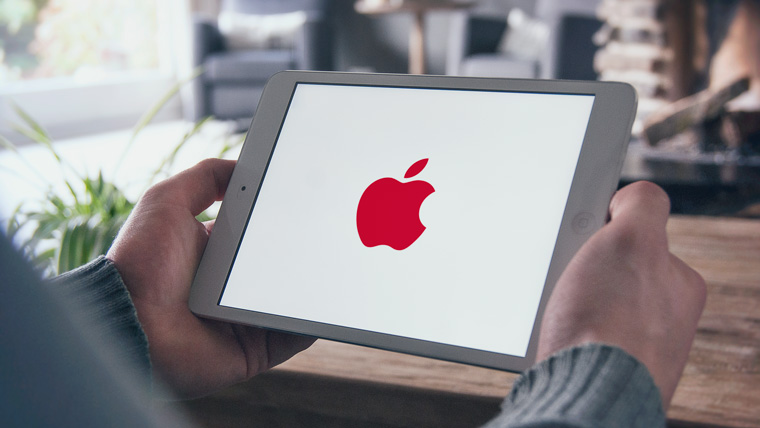
Apple is partnering with Product Red to help raise funds for the Global Fund to Fight AIDS, Tuberculosis and Malaria. On the official website of the company from Cupertino, you can find products, part of the proceeds from which go to this fund. Once a year, on December 1st, on World AIDS Day, Apple colors its logo red.
What's next?
Of course, Apple won't change the shape of its logo. You should not expect exotic color schemes from the company either, now minimalism is in vogue. Perhaps soon we will see the familiar logo made from new materials. Maybe
